React Chart Component
digital-growth-charts-react-component-library is a React 18.2 Typescript component library which 'knows' how to display the results from the REST API, as a familiar digital growth chart.


Features
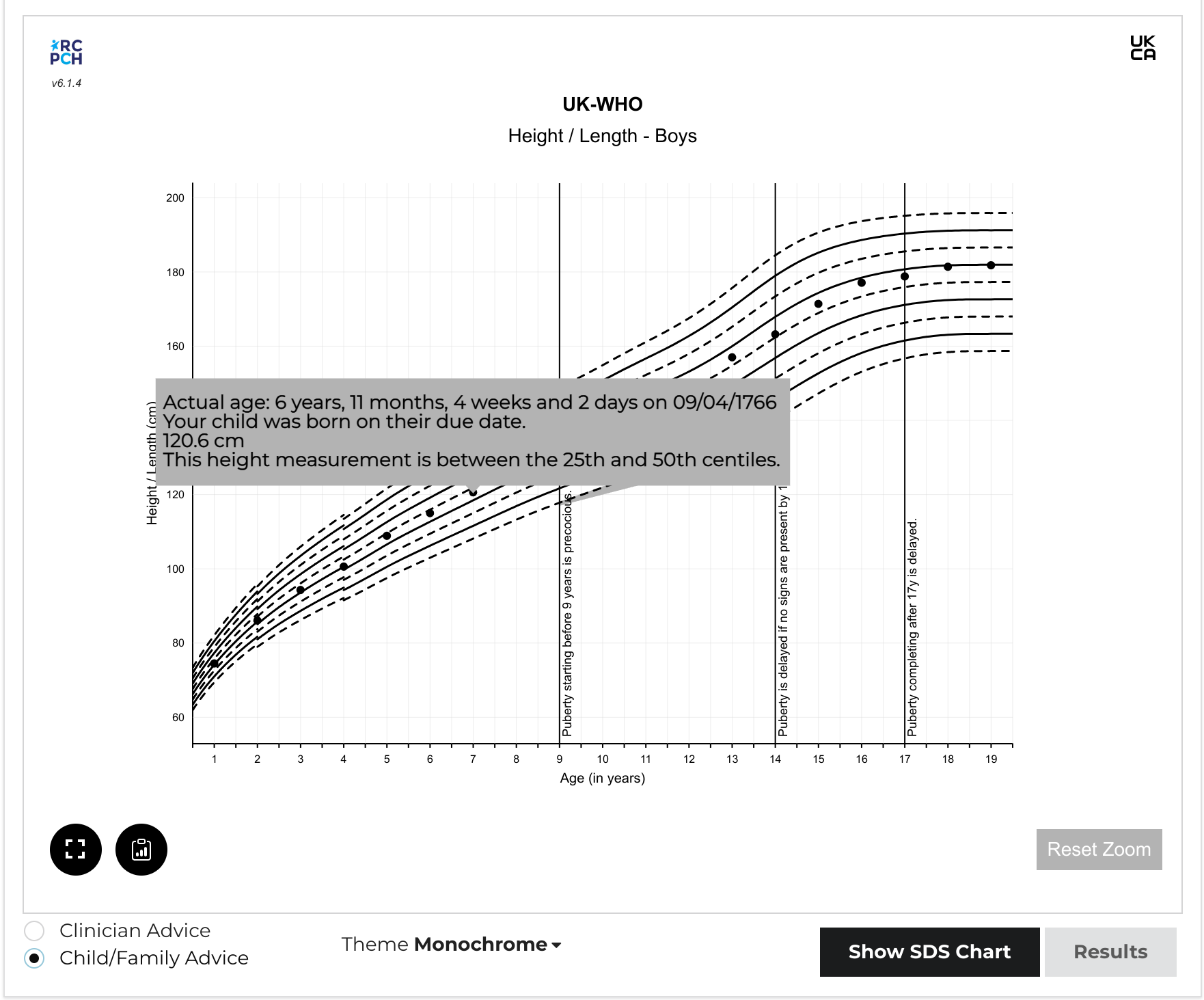
- Calculation and display of height, weight, BMI, and head circumference centiles.
- Support for Down syndrome and Turner syndrome including CDC (US) reference and Down Syndrome (AAP - USA) reference.
- Automatic gestational age correction, throughout the life course.
- Zoomable, scrollable charts.
- Event logging - clinical events can be associated with measurements.
- Bone age integration.
- Mid-parental heights with mid-parental centile lines (at +2 and -2 SDS).
- SDS (Standard Deviation Score) charts.
- Decimal age support.
- Customisable chart colours.
- Save chart image to clipboard.
- Tooltip information which can be optimised for clinicians or families.
- 'Whole Life Course' toggle to view only measurements or whole chart.
You can use the component as-is in a React app, or include it in plain HTML or any other JavaScript framework.
For a full history of what changed in each release, see the changelog and releases on GitHub.
Background
Why a Chart library?
In the process of building the API, we realised the difficulty for developers unfamiliar with growth charts to produce one acceptable to clinicians.
For example, charts typically have 9 main centile lines (though there are other formats), each of which can be rendered as a series. However, the UK-WHO chart is made of several growth references, each from different datasets, and it is a stipulation that they must not overlap. This means that for the four datasets which make up UK-WHO, the developer must render 36 separate 'sections' of centile lines, marrying them up correctly.
Even then, there are certain rules which are key, published by the RCPCH project board. These relate to usability of the charts. For example, the 50th centile should be de-emphasised. These and other rules are listed on the Client Specification.
Given the complexity, we decided to create a React component library for developers to use. We designed it to be customisable for direct use, but also as a demonstration for developers wanting to build the charts from the ground up.
For this reason, we have produced a permissively-licensed, open-source React component, which aims to simplify the process of creating a chart from the chart data received from the API. It makes the job of drawing a vector-graphic centile chart much easier.
If you want to see how the library is implemented, we have built a full client for the RCPCHGrowth API in React, which uses this component library, and can be found here.
Why use React?
React is a popular UI library for Javascript. It has endured well and seems like a popular choice for developers. Importantly, unlike some other Javascript frameworks which are primarily designed for Single Page Applications, React doesn't expect to have the entire webpage to itself. It can be used as a small component in any other web page, even if the main framework being used is completely different.
Tell us what you think
Let us know what you think of our design decisions, on this or any other area of the dGC Project, by chatting to us on our dGC Forum .
What about other frameworks/UI libraries?
If you need us to develop a charting component in a different language or framework, we may be able to do this with you or your company. We would need to discuss the requirements and quote for this service. You should be aware that all such RCPCH-developed artefacts will also be open source. We ensure the licensing of open source components is compatible with commercial use.
Contact us
To contact us for this service, email commercial@rcpch.ac.uk.
Contributing and Implementing
See Contributing for information on how to get involved in the project or how to implement the digital growth charts component into a project.
You can get in touch with the primary developers to talk about the project using any of the methods on our contact page.
Acknowledgements
This Typescript library was built from the starter created by Harvey Delaney
The charts are built using Victory Charts for React. We tried several chart packages for React, but we chose Victory because of their documentation and their ability to customise components.
Licensing
This chart component software is is subject to copyright and is owned by the RCPCH, but is released under the MIT license.
There is important chart line rendering data bundled in the component, which subject to copyright and is owned by the RCPCH. It is specifically excluded from the MIT license mentioned above. If you wish to use this software, please contact the RCPCH so we can ensure you have the correct license for use. Subscribers to the Digital Growth Charts API will automatically be assigned licenses for the chart plotting data.